Savr App Design Sprint
Savr is a mock native mobile app that helps people find recipes to cook great meals at home. They currently have a diverse library of meals and high quality recipes.
by Jessica Soberanes
Scope & constraints.A 5 day google ventures design sprint was conducted to help Savr improve users’ experiences while they are cooking a meal.
The design sprint was conducted by a solo designer using digital interactions only.
Currently, recipes are written as text in ordered steps from start to finish.
Research highlights were provided for review, including 1 user interview audio, quotes from 8 research interviews, and a previously developed user persona.
Scope was limited to solutions aimed at users’ experience when they are prepping and cooking a meal.
“Sometimes I feel like steps are sprung on me...and that turns an enjoyable experience into a stressful one. I like to be as prepared as I possibly can be before I start cooking things that I can’t undo.”
-Anna, user interviews
DAY 1Understand & map
DAY 2Sketch solutions
DAY 3Decide & storyboard
DAY 4Prototype
DAY 5Tests & results
DAY 1- UNDERSTAND Pain points while making a meal.
Recently, Savr has seen some negative reviews about recipes that involve many steps, or more advanced techniques.
Many users who were excited about certain recipes end up disappointed with the outcome, because they didn’t feel the instructions were clear, or easy to execute.
User interviews and quotes where synthesized using affinity mapping and three main themes were found. The design sprint goals were then developed from these themes in the form of three how might we statements.
unexpected results
Users revealed frustration that results were not what was expected. In addition, they did not know how to fix the problems for the next time they try the recipe.
interruptions due to unfamiliarity
Users revealed several interruptions to their cooking due to vague instructions or unfamiliarity with the recipe contents (ingredients or instructions).
task coordination & timing
Users felt that task coordination with prepping and cooking was difficult and confusing. In addition, users found the recipe caused inefficient timing that made cooking a meal take longer than it needed to.
Solution Goals.
How might we help users reduce unexpected interruptions during cooking due to unfamiliarity with a skill, ingredient or unclear instructions?
How might we help users coordinate their prepping and cooking tasks to accomplish efficient timing and successfully execute a dish?
How might we help users catch cooking errors more quickly and learn from their cooking mistakes in order to do better next time?
Using the Kano model to categorize these how might we statements, the main project goal was chosen with an emphasis on helping users with recipe task coordination and management.
Proposed solution- A guided recipe walk through.
With the problem and goals defined, I laid out several user story maps for different solutions. These varied from a focus on voice activated experience to high quality video sequences.
Although these solutions varied in features, they all proposed a recipe walk through experience.
I then considered the constraints of the project and what would be the lowest cost solution to transition from a text based recipe to a more supportive user experience during cooking. These considerations informed the user story map below.
Recipe walk through user story map.
“Timing everything together can be stressful for more complex recipes or meals. Sometimes I have to re-heat a dish...that’s a bummer when you take the time to make something fresh.”
-Silvia, user interviews
DAY 1Understand & map
DAY 2Sketch solutions
DAY 3Decide & storyboard
DAY 4Prototype
DAY 5Tests & results
DAY 2- SKETCH SOLUTIONSLightning demos- Current solutions.
I used the lightning demos exercise to conduct a brief competitive analysis of existing cooking apps. From this exercise I found apps using different solutions to help walk users through more complicated recipes including pictures, lengthy text, and video clips.
Blue Apron App- Accurate Graphics.
This app used a lot of pictures to show the ingredients, prepped and cooked and the final result of the recipe.
They also included a tips and techniques section that helped users with more basic techniques they might not know.
They had a recipe card option for those who wanted to print a physical copy or have a quick overview instead of using the recipe in the app.
NYT Cooking App- Lengthy descriptions.
This app included a side menu to refer back to ingredients when needed.
Recipe instructions were lengthy and the interface bolded the recipe text depending on the step you were on.
The interface was very simplified without many visuals but it was cleaner and less distracting than the visual heavy apps.
Tasty App- Video Heavy.
This app used a time-lapse video of the cooking process to quickly explain the recipe and instructions.
This video was then split into GIFs where users could see the steps separately.
There was a lack of further text instructions or list of ingredients on each step, even though that is included in the video itself.
The app itself was a little buggy and slow, perhaps from the video heavy functionality.
Solution sketching- Emphasis on task coordination.
As I looked through the apps in the lightning demos, I realized that the most difficult screen to get right is the step by step instruction screen. Most apps had very well-designed overall recipe screens, but their “step” screens were varied and lacking in some places. There are many moving parts and the user is in the process of cooking so the design of this screen is critical to their experience as they cook.
After establishing the step by step instruction screen as my critical screen, I used the crazy 8 exercise to explore possible different variations of this screen.
After reviewing the different solutions, I chose to further develop the “gantt chart” screen that put a focus on overlapping tasks and visuals to help users with task coordination as they work through the recipe.
With an emphasis on overlapping tasks, I sketched through a simplified idea of how this task coordination could be visually accomplished.
After sketching a solution for the step by step instruction screen as my critical screen, I began to develop the screens before and after this critical screen.
This helped me understand how the task coordination would take place throughout the walk through portion of the experience.
“I like to be ready for the next few steps. Sometimes I’ll be standing around waiting, and it’s not until later that I realize I could’ve saved 20 minutes by starting on something else.”
-Pete, user interviews
DAY 1Understand & map
DAY 2Sketch solutions
DAY 3Decide & storyboard
DAY 4Prototype
DAY 5Tests & results
DAY 3- DECIDE & STORYBOARDSolution chosen- Gantt chart style design.
I chose a solution which incorporates sub-task tracking and management components to the cooking steps, specifically using a gantt chart type design.
I decided to choose this solution because much of the feedback from users centered around timing and time wasted during cooking. This meant that a focus on multitasking and starting other tasks while still waiting for others to finish was important to users so that they could cook efficiently and have items prepared in time for time-sensitive steps.
Story board- Making black bean enchiladas.
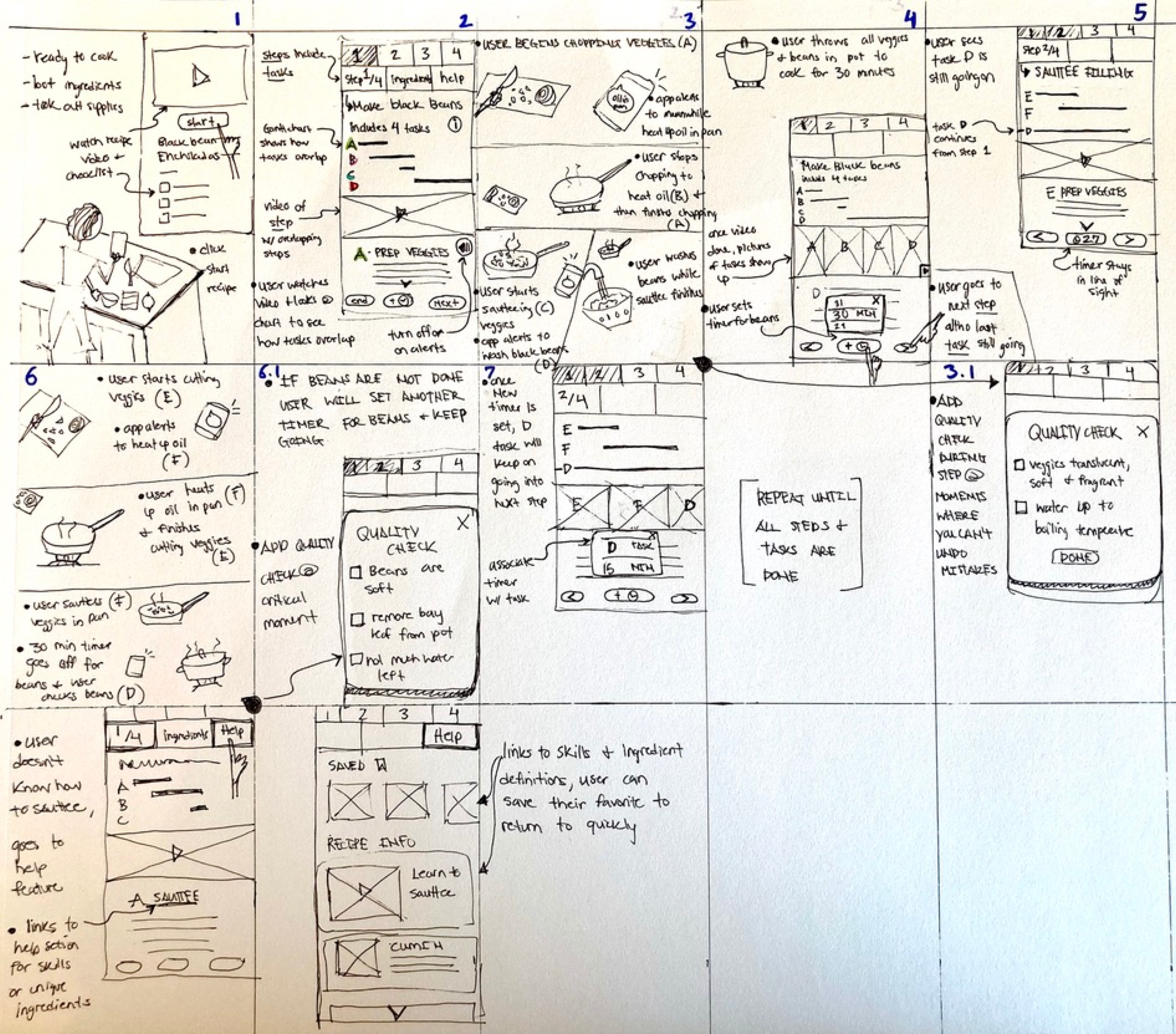
This story board walks a user through the first two steps of making a fairly complicated recipe for black bean enchiladas.
The goal was to break down the larger recipe steps into tasks. The design goal is to help the user understand how these steps and tasks can overlap, and help them make their cooking time more efficient and avoid missteps.
Other supportive features include the option to receive alerts from the app guiding them when to switch between tasks or setting a timer in the app.
“There is no sincerer love than the love of food.”
-George Shaw, Irish playwright
DAY 1Understand & map
DAY 2Sketch solutions
DAY 3Decide & storyboard
DAY 4Prototype
DAY 5Tests & results
DAY 4- PROTOTYPEPrototype- Savr recipe walk through.
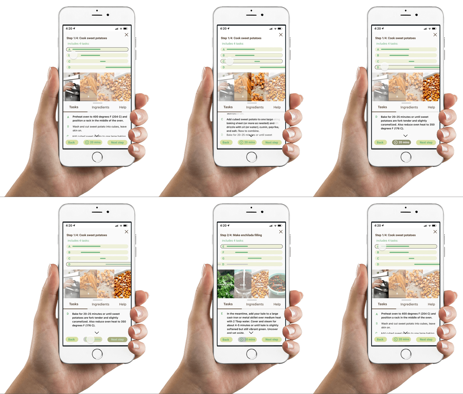
I spent Day 4 developing a prototype that incorporates sub-task tracking and management components into the recipe walk through experience, specifically using a gantt chart style visual design.
Several challenges arose as I broke down the recipe into steps and each step into sub-tasks. Visually, the screen became crowded and recipe text itself did not have much room at the bottom of the screen. It was difficult to balance the importance of the recipe text and the task management display.
Although in practice the gantt chart style design was presenting difficulties, testing was still conducted in order to validate the solution or find specifically what did not work.
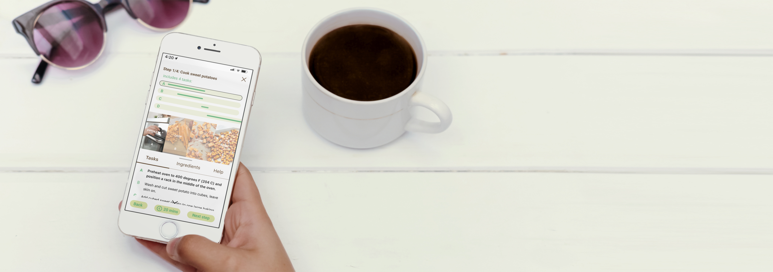
A snippet of the prototype to the left shows how the gantt chart style recipe walk through would look for the first tasks to make black bean enchiladas. See link to full prototype below.
“I would give it a try, especially if they gave me really cool recipes and then broke it down into those steps, so I can conquer even something that looks very complicated.”
-Jill, usability testing
DAY 1Understand & map
DAY 2Sketch solutions
DAY 3Decide & storyboard
DAY 4Prototype
DAY 5Tests & results
DAY 5- TESTS & RESULTSUser Testing- Sub-task clarity needed.
I chose to conduct 5 moderated usability tests with young adults who were interested in cooking and better following recipes. They walked through a prototype in which they were going to make a recipe of black bean enchiladas with the new walk through experience.
Despite the design difficulties with a crowded screen, users responded very positively to the gantt style task flow graphic, and loved the intuitive visual that showed them coordinated tasks. Still, four main user difficulties emerged from the data.
Tasks that continued throughout several recipe steps, although shown graphically, were difficult to see and understand.
The relationship between recipe steps and step tasks was unclear and confusing.
The button to enter the recipe walkthrough was unclear and often missed. Users jumped straight to reading the recipe text.
The purpose of the timer button was unclear and users were not sure if it was related to the step overall or the tasks.
Conclusions- Simplify and condense visually.
This design sprint confirmed that incorporating a gantt style, task coordinating design into a recipe walk through is a viable solution to helping users better coordinate and accomplish their recipe tasks. Several changes are recommended to better simply and condense the visual design in order to make the experience more clear to users.
Proposed changes include:
Eliminate recipe steps vs. tasks, and provide only recipe steps that are broken down into smaller steps visually (eliminate alphabetical task labels).
Incorporate gantt chart style bars into step visuals themselves.
Increase the space for recipe text.
Redesign timer button with clear iconography and content.
Use visuals and animation to better show the transition of a recipe step from one screen to the next- showing the continuation of that step into the following one.


