Making Good
A mobile app that empowers DIYers to practice sustainability in their home improvement projects.
by Jessica Soberanes
People want to help the earth. People are interested in sustainability. I am interested in these amazing people, and how we can help them make their projects more sustainable.
The construction industry accounts for 25% to 40% of the world’s total carbon emissions.
Mining, processing, transporting, and disposal of materials for construction or renovation projects have a large carbon impact.
65% of DIYers said they would pay more for a sustainable product or brand.
“Environmental sustainability is about stabilizing the currently disruptive relationship between earth's two most complex systems: human culture and the living world.”
— Paul Hawken
This case study is a snippet of how we can help DIYers heal this relationship as they care for their homes.
Current online resources leave DIYers feeling overwhelmed, discouraged and unsure how to help.
My solution emphasized giving people access to actionable sustainability information, and found ways to help them better understand it.
Feedback from testing validated some solutions, but also turned others upside down to reveal what a viable solution would really need.
Process:
1
Initial Research & Analysis
2
Problems & Solutions
3
Testing Outcomes
4
Conclusions & Desired Results
Constraints:
One woman band- I worked solo to conceptualize, design, and test this solution.
Testing was limited to digital interactions.
Scope:
Solution scope was limited to one user red route.
Users are DIYers interested in incorporating sustainable practices into their home improvement projects.
“I don't think it's as easy as it should be for people to be aware and to be actively doing something [sustainable practices]. I think it takes more effort than it should.”
— Steven
1
Initial Research & Analysis
Where things are now: Lack of access & difficulties understanding.
Excited for an excuse to talk to awesome folks, I found and interviewed 7 sustainability-minded DIYers.
As I sifted through the gold mine of user feedback, and used the Kano model to identify the “must-have” insights- I arrived at the two most critical difficulties they currently face.
[lack of] Access
The current process to find and access sustainability information online is confusing and overwhelming. DIYers don’t know where to find sustainable materials or practices even though they think sustainability is important.
{process of information discovery and consumption}
[difficulties] Understanding
Current information about sustainability online is unclear and not directly relevant. DIYers don’t know what information to trust or how to turn information into actionable steps for their home improvement projects.
{quality of information and the context given}
“I think there are so many options, and so many resources that exist...I personally find that to be overwhelming... And it's hard for me to figure out what [is] legitimate and... what I can dismiss.”
— Robert
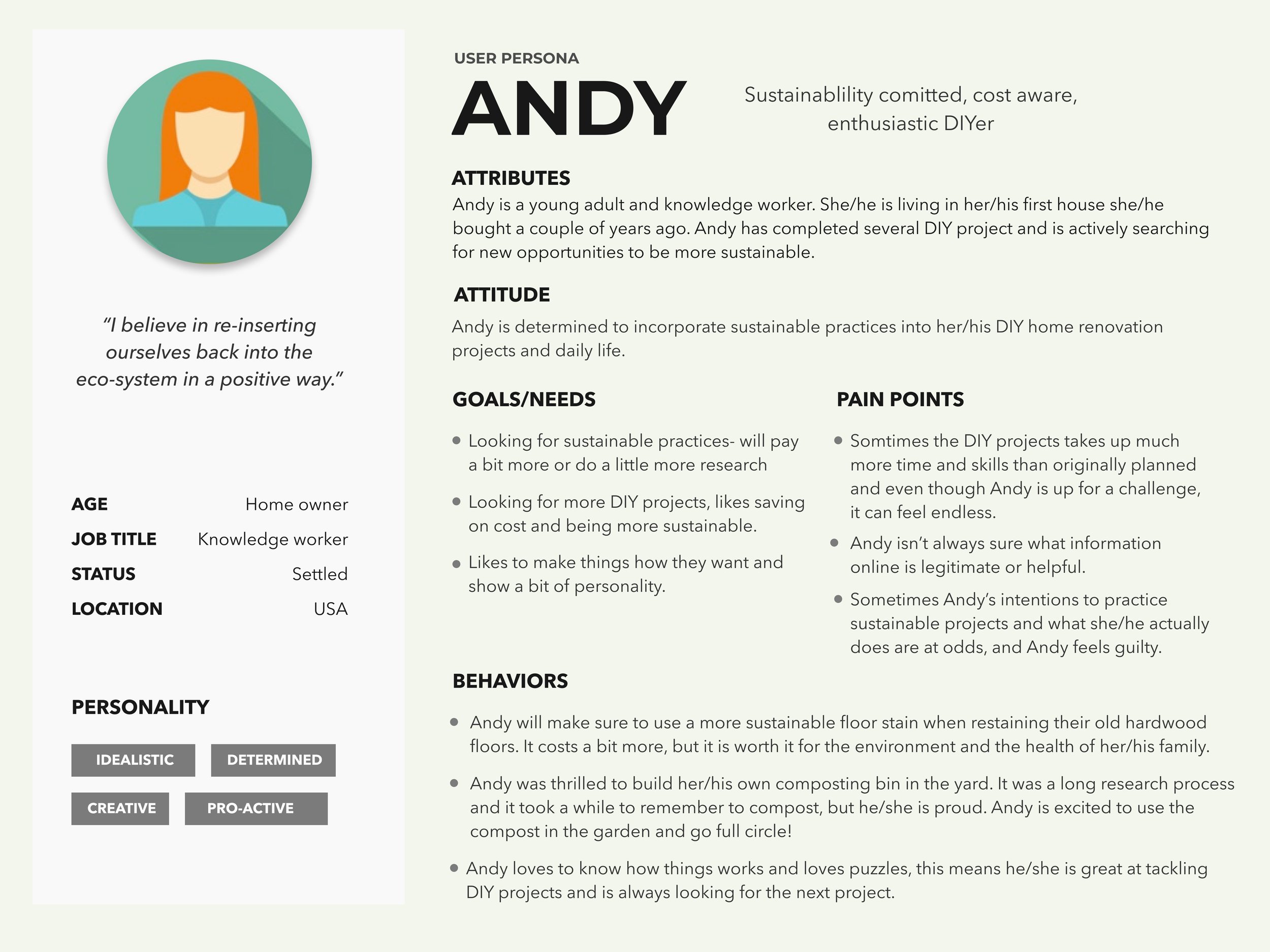
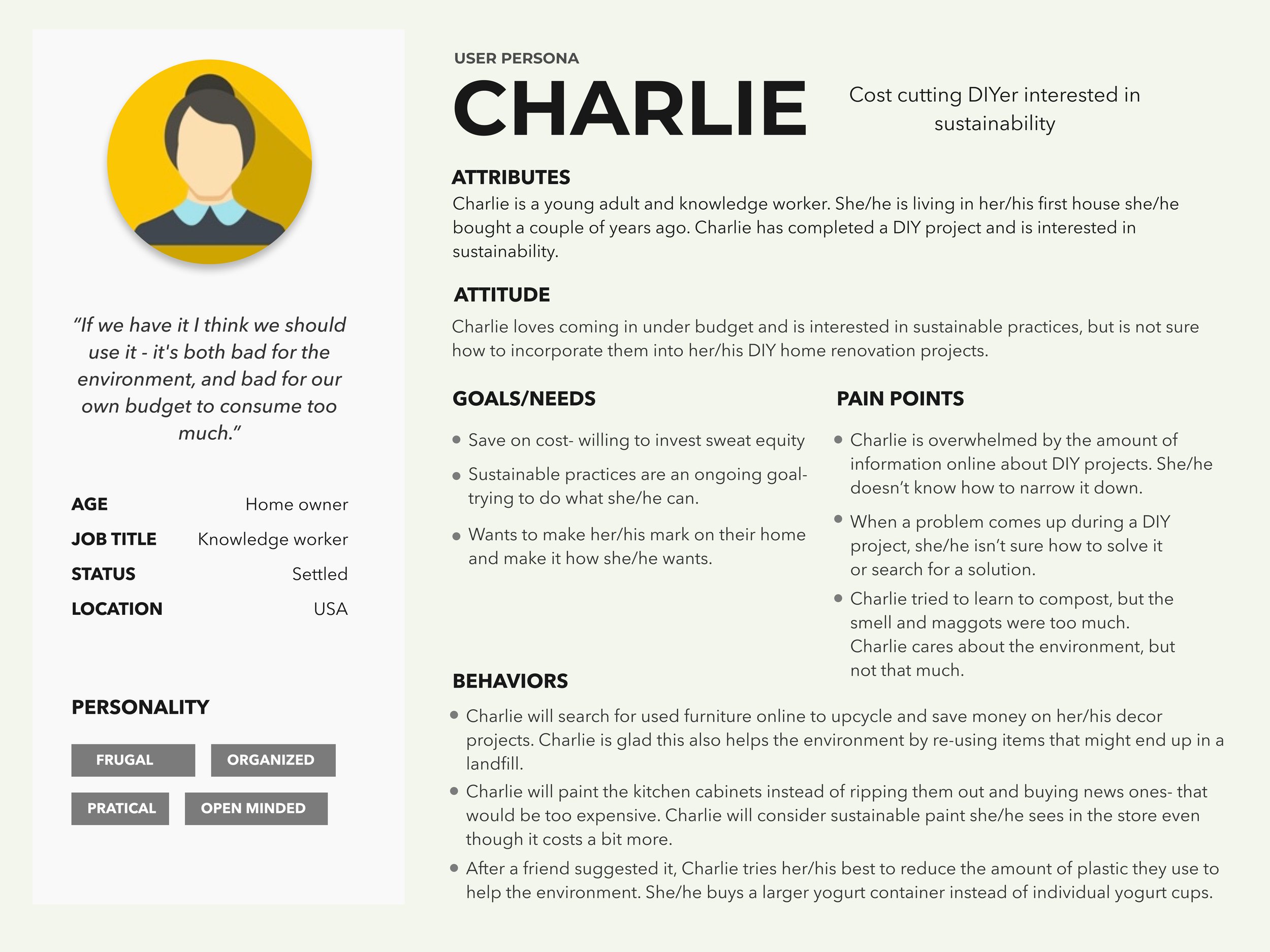
The stars of the show: The Doers and Carers.
After getting to know my stellar interviewees and their current difficulties, I decided it probably wasn’t ideal to call them everyday for more information (even though I wanted to...).
Instead, I created two personas to embody their different pain points, needs and behaviors. These personas would guide my design descisons and ground my solutions in “real” people’s behaviors and motivations.
Andy and Charlie each have common interests in sustainability and DIY home improvement projects, but different levels of interest and motivations.

Andy (the carer) is an idealist, creative and pro-active DIYer. They are the kind of person who will be sure to use a more sustainable floor stain when restaining their old hardwood floors. It costs a bit more, but it is worth it for the environment and the health of their family.

Charlie (the doer) is a frugal, practical yet open-minded DIYer. They are the kind of person who will search for used furniture online to upcycle and save money on their decor projects. Charlie is glad this also helps the environment by re-using items that might end up in a landfill.
“I believe in reinserting ourselves back into the ecosystem in a positive way.”
— Andy
“If we have it I think we should use it- it’s both bad for the environment and bad for our own budget to consume too much.”
— Charlie
User stories, flows and iterations.
With a better understanding of users’ struggles, goals and realities, I laid out the overall user story for a DIYer starting and completing a home improvement project. Where would a solution best fit in order to alleviate the biggest challenges these well intentioned people faced?
User stories
Users already had robust solutions for the browsing (pinterest, instagram), material gathering (home depot, amazon), and executing (youtube, facebook videos) portions of the project process.
Considering the lack of access and difficulties understanding that users faced, a solution made sense during the time people were deciding what to do, and how they would do it.
I narrowed the scope of the minimum viable product in the planning and gathering skills portion of the home improvement project process.
User flow
Taking into account insights, personas and user stories, I began finding solutions by laying out user flows and beginning the wireframing process.
Wireframes
Wireframe user tests provided user insights emphasizing clarity of experience and gave way to the project’s proposed solutions.
“Give a man a fish, and you feed him for a day. Teach a man to fish, and you feed him for a lifetime.”
-Lao Tzu
2
Problems, Goals & Solutions
Teach a man (DIYer) to fish (work sustainably).
Sustainability in the construction and renovation industry is an ever evolving and complicated problem. So instead of just telling DIYers what to do in this realm, our solution proposes showing them why they should do it and how their actions affect the overall system.
Said in a different way, this means helping DIYers learn the thinking and mind frame around sustainability and how it affects their current home improvement projects, so they can better know how to implement sustainable practices into their project.
Goal 1- Access
How might we give DIYers easy and helpful access to information about sustainable products and practices relevant to their specific home improvement projects?
{process of information discovery and consumption}
Solution 1 - Project based Access
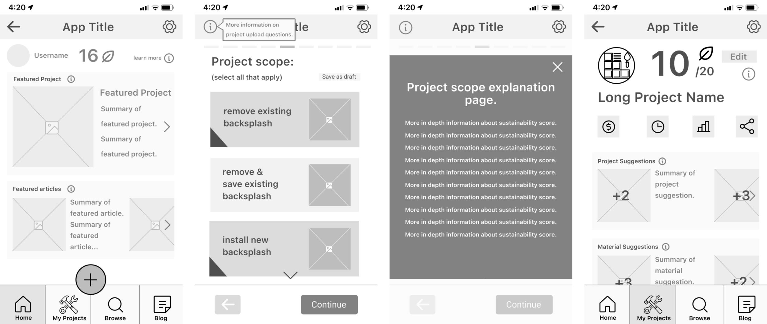
Offer users a quiz style experience where they create their own DIY home improvement projects on the platform and are given a sustainability score and sustainability suggestions to improve their project.
{interactive project based experience}
[Project quiz flow]
An interactive experience ensures that the information about sustainability that DIYers are getting is actually relevant to their mindset and project, and can more easily turn into actionable steps in their project.
Goal 2- Understanding
How might we help DIYers build understanding by giving them clear, actionable, and trustworthy information about sustainability in the home improvement realm in order to empower them to make responsible choices?
{quality of information and the context given}
Solution 2 - Relevant Information
Integrate educational, trustworthy and example-based information screens (“educational detours”) into the project quiz and project scoring experience that will help DIYers learn about sustainability relative to their project.
{interwoven snippets of sustainability information.}
[Sustainability information screens]
Interwoven “educational detours” ensure sustainability information is relevant to DIYers’ project and mindset, giving information a better context for understanding and absorption.
“The true method of knowledge is experiment.”
-William Blake
3
Testing Outcomes
User testing insights.
I conducted two rounds of moderated usability testing to gain feedback from the target audience about the proposed solution. Findings from each round of testing were gathered and interpreted under the lens of the project goals outlined above- creating access and understanding of sustainability information.
Insights around Access (information discovery): Leveraging graphics, user freedom, system signaling
Insights around Understanding (information quality): Sustainability mental models
Leveraging graphics- Testing revealed that there was an opportunity to use graphics in the questionnaire to better help users answer the questions.
Hypothesis
The original quiz questionnaire design kept graphics consistent on each answer card in order to reduce confusion and minimize overwhelm.
Results
Users did not consistently look to the graphics for help to answer questions. They often focused more on the small titles than the larger graphics.
Changes
Graphics were leveraged to actually help users answer the question. This included simplifying them in some places and refining them in others.
Graphics crowded answer cards without providing new information.
Project quiz flow [First round of testing]
Graphics were simplified to reduce noise or refined to provide better context.
Project quiz flow [Updates after testing]
Expanding user freedom- Testing revealed users wanted more freedom to learn more before they selected an answer.
Hypothesis
The answer card graphics and labels are sufficient to give users a clear pathway to confidently answering the question.
Results
Users wanted to learn more about each answer before they committed to an answer. If they actually saw the tiny “see more” link on the card, they tried to click it on each page.
Changes
The more info button and feature was further built out to allow users more freedom to access more information when desired.
Project quiz screens [First round of testing]
The initial design had a very small and hard to read link to “see more” about the answer.
Project quiz screens & more info screens [Updates after testing]
A larger button was added to access more information about question answers.
Screens were further built out to help users better understand what the answers mean.
System signaling- Testing revealed the need for clearer signaling of the opportunity to learn more about sustinability during the quiz questionairre.
Hypothesis
An information icon and tooltip are sufficient to notify users of an opportunity to learn more about sustainability in the context of their project.
Results
Almost all users did not notice or click on the information icon. Once the button was pointed out by the tester, many users were excited to learn.
Changes
The information icon was changed to a button. A mini onboarding was added to prompt users of their opportunity to get a snippet of sustainability information.
Project quiz screens [First round of testing]
Mini onboarding before quiz [Updated after testing]
Project quiz screens [Updates after testing]
In the first round of testing, the design included an information icon and tooltip signaled to interested users- the Andys of the world- to learn further about sustainability.
After feedback from users, the updated design incorporated a mini onboarding and unique button to better signal the opportunities for learning.
User mental models- Testing after updates revealed users were still confused about how the project quiz, sustainability score, and sustainability information all worked together. A structural overhaul is needed to remedy this key part of the solution.
Hypothesis
The project quiz, sustainability score, and “educational detours” work together to give users a varied experience to find sustainable options for their home improvement projects.
Results
Even after more information screens about the sustainability quiz and “educational detours” were added, user mental models of the quiz experience and the sustainability scoring were not matching up with the designer mental models.
Changes
A larger structural overhaul of the app organization is needed in order to make these critical aspects of the experience work well together and reinforce each other.
Project score screen [First round of testing]
Project score screens [Updated after testing]
After feedback from users, an extra screen showing a bit more information about the score was developed to better define the different breakdown of the scoring system.
After updates, users were still unclear about the sustainability score.
Mini onboarding screens [Updates after testing]
Testing also revealed that the educational detours worked into the quiz experience were unclear. A mini onboarding was added to the beginning of the quiz questionnaire to clarify the purpose of the quiz, and what the helpful information was available for them.
After updates, users were still confused about the purpose of these detours.
What if the questions you ask and how you ask them help frame the problem in a way that empowers people to better learn, understand and act?
4
Conclusions & Desired Results
Conclusions- Mental models need to be aligned.
As the last testing insight outlined, a structural overhaul needs to be undertaken of the project quiz, sustainability score, and educational detours, in order to consistently address our project goals of access and understanding.
The graphic above shows how the experience currently works, with a more linear questionnaire path and opportunities to navigate away from and dip into sustainability information (“educational detours”).
The graphic above shows the proposed shift to the quiz style experience. I am proposing to integrate the sustainability data seamlessly into the quiz, and project scoring system themselves.
More specifically, some of the changes would include:
Redefine the score to correspond with every question asked- as users understand the questions they begin to understand the score.
Eliminate any question that isn’t immediately relevant to sustainability score.
Add information about sustainability directly into the quiz questions & answers.
Use graphics & relevant examples to more clearly define sustainability concepts within the quiz answers.
Strike an imperative balance between too much information and not enough.
I believe this would make a more successful experience for users, supporting a more simplified and understandable mental model of app experience so that users could focus on the content of sustainability information and applying it to their projects.
Desired results- “What’s your Making Good score?”
The are several use cases that would be desired if this experience were to be launched, both for one-time users and power users. Future possibility for expansion into a professional market would also be considered.
References app to help them plan several of their ongoing DIY home improvement projects.
{Power user}
Only uses app for one project, and learns a bit about sustainability along the way- carries that thinking into future projects.
{One-time user}
Refers back to app while completing project for product and skill information.
{Power user}
Shares project score and results with friends via social media.
{Power user & one-time user}
These use cases would provide a framework in which to measure success, expand features, and integrate a business model in order to make a feasible product.
“Obviously, we can't do everything. But if we have the opportunity to connect ourselves with things not directly tethered to our lives, it not only makes a bigger impact on the world, but it makes a bigger impact on us because we feel like we're part of something.”
Stacey
Final thoughts.
Overall, the quote above really reflects the continuing intention of the project.
Through this solution we are asking:
How can we help people harvest the good intentions and care they have for the environment into actionable practices they can incorporate into their home? People’s homes are a central part of their lives where they can care for their families and communities, and hopefully better care for the environment.


